Stream Talent
Stream Talent
Highlighting the right people with a recruiting rebrand
Stream Talent is a recruitment agency focussed on finding the right people. They do this through building connections, spending time with their clients, transparency, and clear communication. The existing Stream brand was dated and had a more technical appearance rather than putting people at the forefront. The team approached Kaliber to create a new logo and brand identity that reflects the new values, as well as the innovative motivations behind Stream.
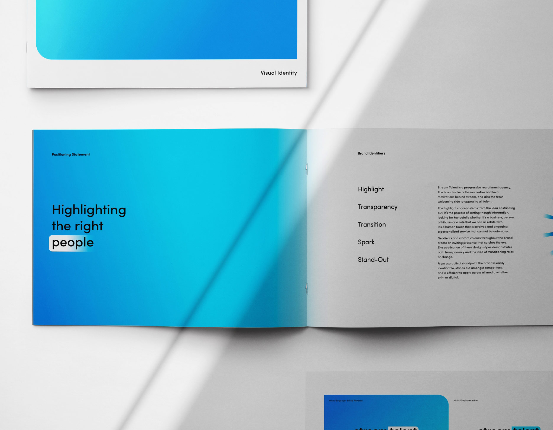
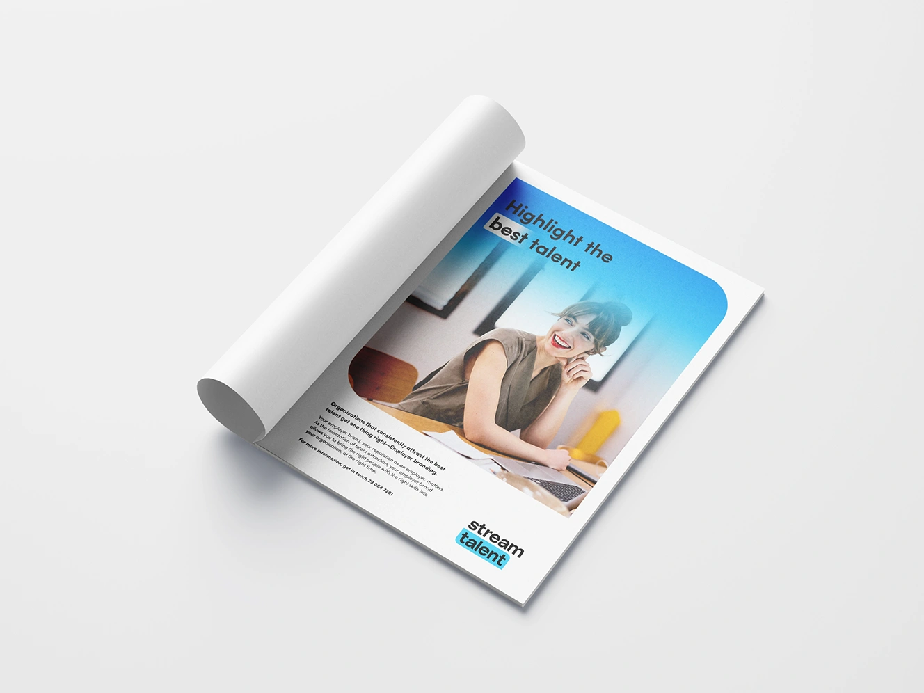
Stemming from the idea of transparency and the human element, the brand made use of translucent gradients and candid photography. Highlighting important messages throughout the brand through the use of a ‘highlighter’ was key in conveying clear communication and also plays on the idea of standing out in the crowd.

Bright Blues and Great Greens
With two core user types (employers and employees), a system was required to easily separate and identify each. For an easy navigational journey through the website the main colour palette consists of two colour groups; bright blues and great greens. Bright blues represents employers and great greens represent candidate or employees. These colour groups are applied across the every brand application; digital, print and advertising.


Highlight the good
The highlight concept stems from the idea of standing out. It’s the process of sorting though information, looking for key details whether it’s a business, person, attributes or a role that we can all relate with. It’s a human touch that is involved and engaging, a personalised service that can not be automated.
Transparency is key
Gradients and vibrant colours throughout the brand create an inviting presence that catches the eye. The application of these design styles demonstrates both transparency in communication and the idea of transitioning roles, or change.


Let's work together
Get in touch


