

AME

AME
A dynamic new visual identity for a sports marketing agency
AME is dynamic marketing agency focusing on video content, production, and social media management services, primarily for sporting personalities or sports related brands. AME wanted a rebrand to reflect the values they stand for and how they represent the company. As an established business, the existing brand was dated and didn’t reflect the energy and passion they deliver across their projects. They exist to push boundaries and engage customers – recently expanding their services to include digital media, one objective of the rebrand was to create something that highlighted an energetic brand experience.
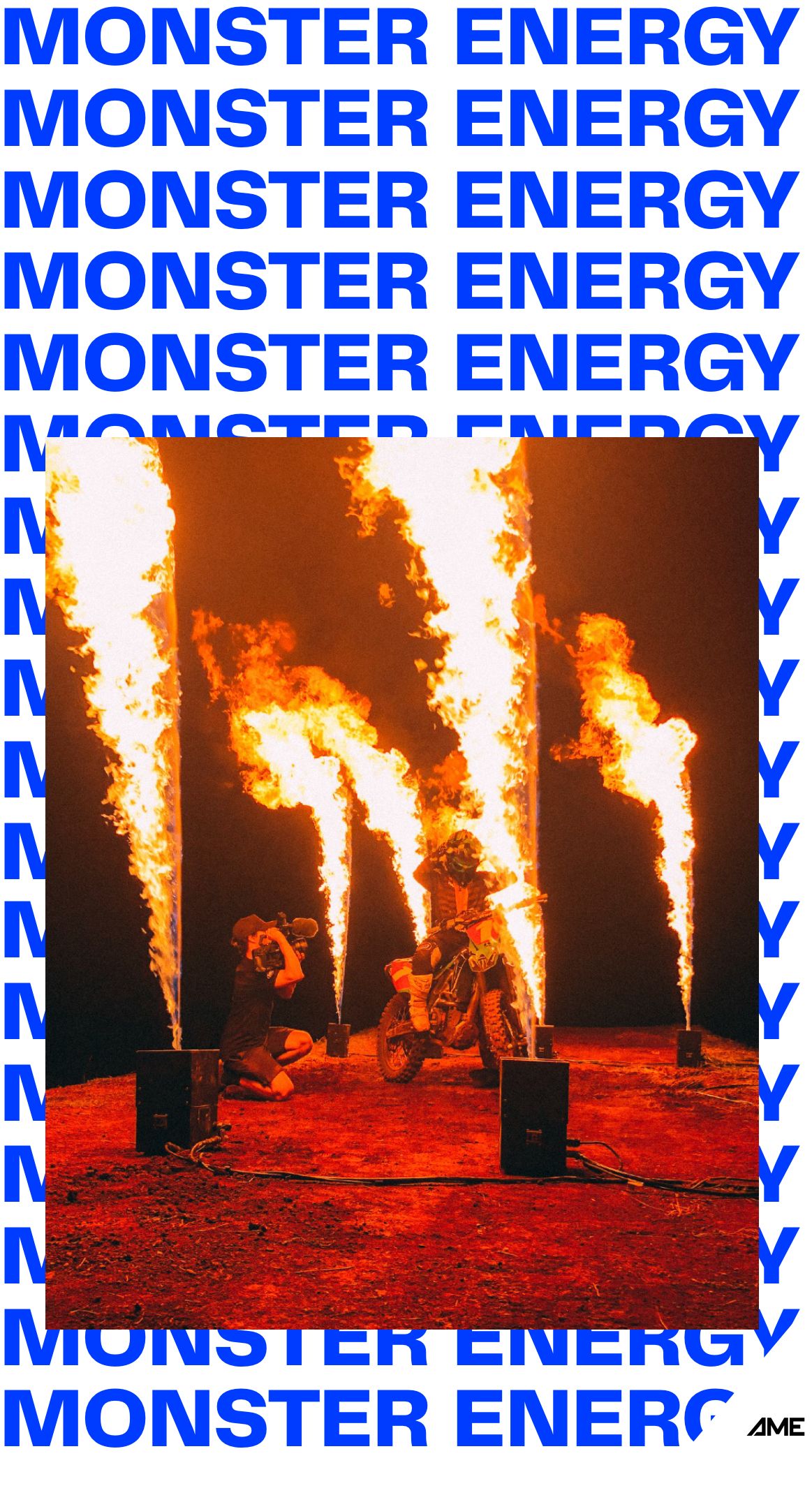
With an existing brand and current market recognition, it was important for AME to retain some of the original brand elements. The logo received a small update to modernise the look and feel and better fit within the brand refresh. The black and blue colour palette was also retained, though the blue has been updated to better align with today’s digital landscape and add some more contrast and energy to the brand. More white was also introduced to provide further flexibility in the brand application through design and layout.
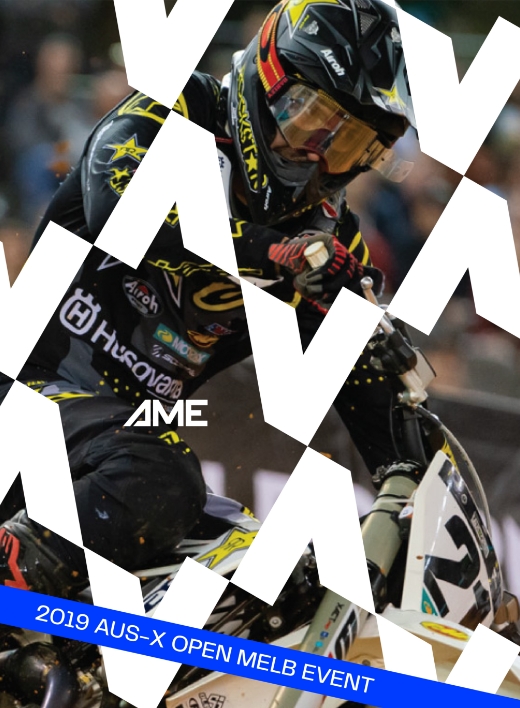
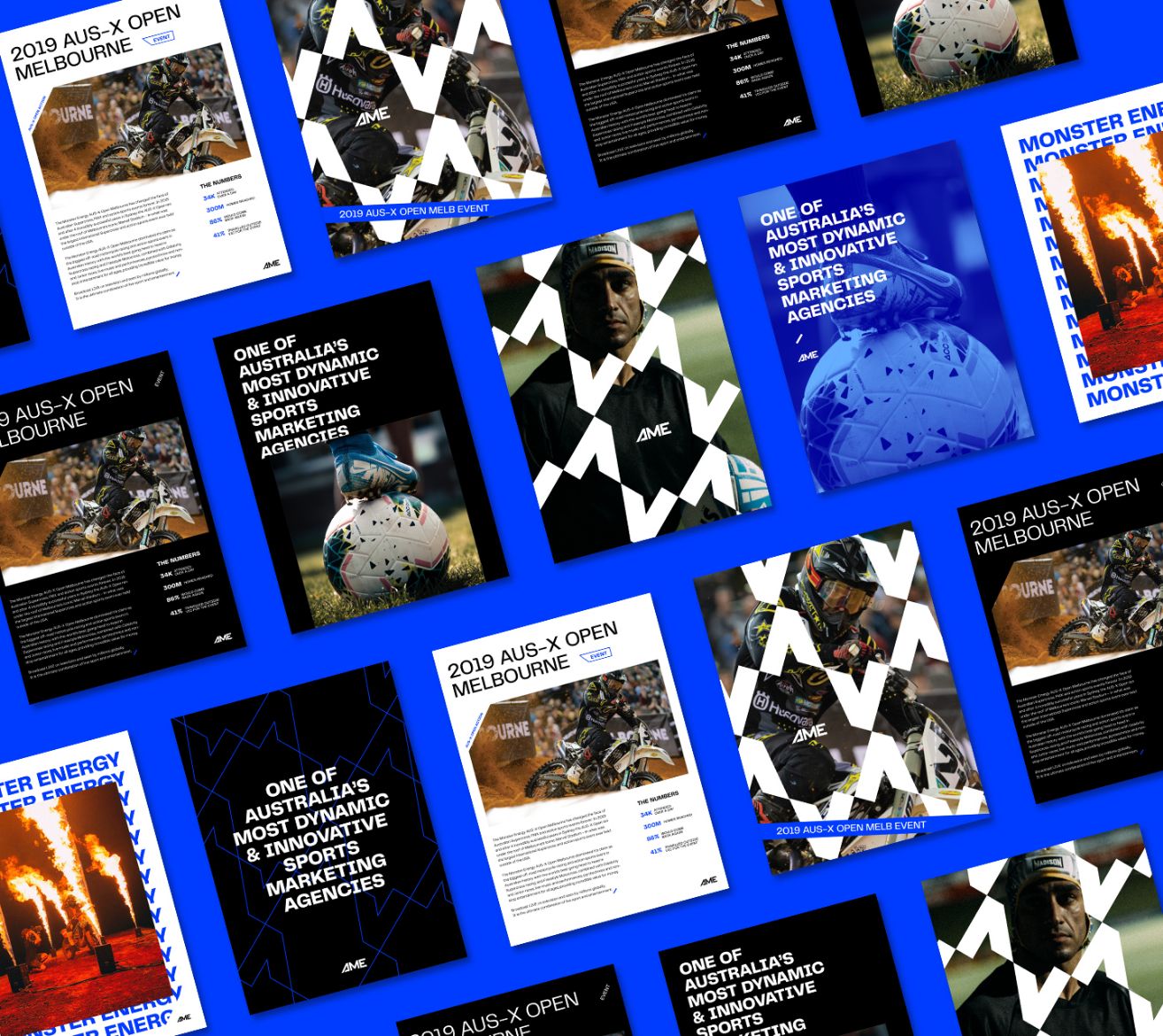
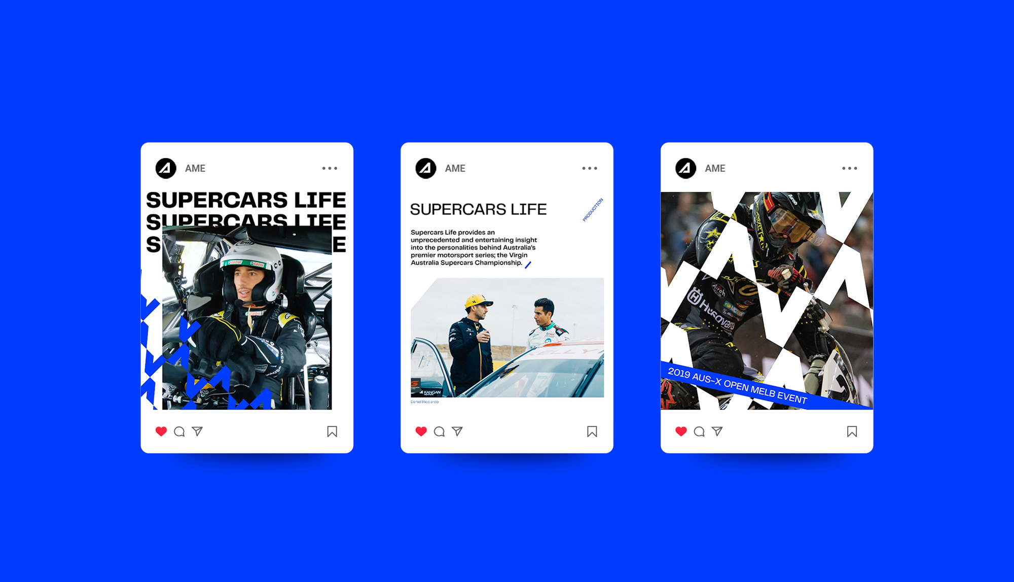
Our focus with any brand identity project, is how it will be seen by customers in the real world. We create examples of the brand in application across all media relevant to the business, in the case of AME this includes print design, digital and social assets, with varying amounts of content.
In addition to this, sometimes a different feel is required across the AME collateral depending on the purpose of the design. The brand identity was designed to be dynamic, it can be loud and bold to create energy, or paired back for a more professional appearance when conveying information. Multiple graphic design elements can be layered to convey a feel of engagement and interaction, whilst bold shapes and typography demonstrate an authoritative presence with passion.


A strong pattern originating from the logo design is a prominent part of the AME brand. Although stemming from the ‘A’ shape, it also represents arrows pointing in different directions, showing movement. It can be used as part of a design layout, overlaid on photography or videography, or as a stand-alone design element to catch the eye. When combined with the other assets, the patterns flexibility throughout the rebrand helps create a consistent and recognisable identity.
Let's work together
Get in touch